import matplotlib.pyplot as plt
import polars as pl
from matplotlib.ticker import StrMethodFormatter
from pygris import counties, tracts
from pygris.utils import erase_water

from census_helpers import get_censusCensus Data in Python, Part 2: Mapping with pygris and GeoPandas
Pulling census geometry and making choropleth maps of North Carolina
Download census boundaries with pygris, join them to your Census API results, and map North Carolina counties and Mecklenburg County census tracts with GeoPandas.
NoteAbout this tutorial
Time: about 25 minutes. Prerequisites: Census Data in Python, Part 1, including the census_helpers.py file you saved at the end of that tutorial.
By the end, you will be able to:
- download county and census tract boundaries with pygris
- join census data to those boundaries using the GEOID
- make a choropleth map with GeoPandas and matplotlib
- choose a map projection that suits North Carolina
- map census tracts, remove large bodies of water, and add county outlines
- make an interactive map for exploring your data
Why a second library?
Polars is fast and pleasant for tables. It doesn’t support geometry, though. For maps you will use GeoPandas, which adds a geometry column to a pandas DataFrame. You will download the shapes themselves with pygris. Kyle Walker wrote pygris as the Python version of tigris, the R package that tidycensus uses to fetch boundaries.
The workflow looks like this:
- Pull the numbers from the Census API with
get_census()from Part 1. - Pull the matching shapes with pygris.
- Join the two on
GEOID. - Map the result.
In R, geometry = TRUE does steps 2 and 3 for you. In Python you do them yourself, and it takes only a few more lines.
Setup
pip install pygris geopandas matplotlib pyarrow folium mapclassifyGeoPandas needs pyarrow to receive data from Polars. folium and mapclassify are only needed for the interactive map at the end.
Downloading boundaries
pygris has one function for each type of census geography. Let’s start with North Carolina counties:
nc_shapes = counties(state="NC", cb=True, year=2024, cache=True)

nc_shapes.head()
Using FIPS code '37' for input 'NC'| STATEFP | COUNTYFP | COUNTYNS | GEOIDFQ | GEOID | NAME | NAMELSAD | STUSPS | STATE_NAME | LSAD | ALAND | AWATER | geometry | |
|---|---|---|---|---|---|---|---|---|---|---|---|---|---|
| 90 | 37 | 047 | 01026339 | 0500000US37047 | 37047 | Columbus | Columbus County | NC | North Carolina | 06 | 2429920494 | 43711694 | POLYGON ((-79.07124 34.2993, -79.06894 34.3010... |
| 91 | 37 | 039 | 01008545 | 0500000US37039 | 37039 | Cherokee | Cherokee County | NC | North Carolina | 06 | 1179842036 | 28813680 | POLYGON ((-84.31749 35.02184, -84.31748 35.021... |
| 92 | 37 | 149 | 01008579 | 0500000US37149 | 37149 | Polk | Polk County | NC | North Carolina | 06 | 615606325 | 1964035 | POLYGON ((-82.35925 35.22993, -82.35924 35.230... |
| 93 | 37 | 009 | 01008535 | 0500000US37009 | 37009 | Ashe | Ashe County | NC | North Carolina | 06 | 1104023356 | 8058446 | POLYGON ((-81.74065 36.41314, -81.7373 36.4135... |
| 94 | 37 | 055 | 01026133 | 0500000US37055 | 37055 | Dare | Dare County | NC | North Carolina | 06 | 992558552 | 3000513281 | MULTIPOLYGON (((-75.72681 35.93584, -75.71827 ... |
A few arguments deserve a note:
cb=Truerequests the cartographic boundary files. These are simplified shapes that draw quickly and follow the coastline. Leave it off only if you need the precise legal boundaries.year=2024matches the shapes to the 2020 to 2024 ACS data you will join to them.cache=Truesaves the files on your computer. The next request for the same shapes loads instantly.
The result is a GeoDataFrame with 100 rows. Its geometry column holds each county’s outline. It also has a GEOID column in the same format that get_census() produces. That shared column is what makes the join work.
Check the coordinate reference system (CRS) and make a quick plot:
print(nc_shapes.crs)
nc_shapes.plot()
EPSG:4269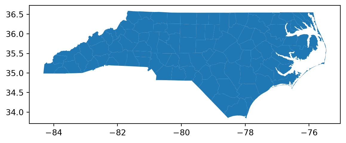
The CRS is EPSG 4269, called NAD83. It stores locations as longitude and latitude.
Joining census data to shapes
Get median household income for each county, just as you did in Part 1:
nc_income = get_census(
    dataset="acs/acs5",
    year=2024,
    variables={
        "median_income": "B19013_001E",
        "median_income_moe": "B19013_001M",
    },
    geo_for="county:*",
    geo_in="state:37",
)
GeoPandas can’t merge with a Polars DataFrame directly, so convert it with .to_pandas() first. Keep only GEOID and geometry from the shapes. Otherwise both tables would contribute a NAME column and you would end up with NAME_x and NAME_y.
nc_map = nc_shapes[["GEOID", "geometry"]].merge(
    nc_income.to_pandas(), on="GEOID", how="left"
)

nc_map.shape
(100, 5)Put the GeoDataFrame on the left side of the merge. The result then stays a GeoDataFrame that you can map. Using how="left" keeps every county even if its data is missing.
TipCheck your join
After any join, confirm that the rows matched. nc_map["median_income"].isna().sum() counts the counties with no data. If that number is large, compare a few GEOIDs from each table. Look for missing leading zeros, or for a GEOID that was stored as a number.
A choropleth map
A choropleth map shades each area by the value of a variable. GeoPandas makes one with .plot(column=...):
fig, ax = plt.subplots(figsize=(12, 5))

nc_map.plot(
    column="median_income",
    cmap="viridis",
    edgecolor="white",
    linewidth=0.2,
    legend=True,
    legend_kwds={"orientation": "horizontal", "shrink": 0.5, "pad": 0.02},
    missing_kwds={"color": "lightgrey"},
    ax=ax,
)

ax.set_title("Median household income by county, North Carolina (2020 to 2024 ACS)")
ax.set_axis_off()
fig.axes[1].xaxis.set_major_formatter(StrMethodFormatter("${x:,.0f}"))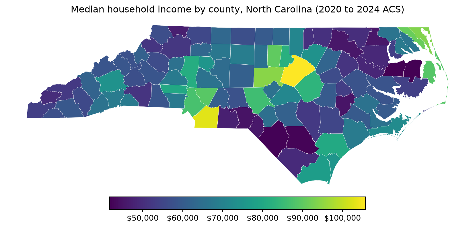
Here is what each piece does:
cmap="viridis"uses a color scale that is easy to read for people with color vision deficiencies.missing_kwdsdraws counties with missing data in gray. Without it, those counties would disappear from the map.ax.set_axis_off()hides the longitude and latitude ticks. They rarely help a reader.- The last line formats the legend as dollars. The legend is a second set of axes, so it lives in
fig.axes[1].
Choosing a projection
Longitude and latitude describe points on a globe. Drawing them directly on a flat screen stretches the map a little. North Carolina has its own projected CRS, called NAD83 / North Carolina (EPSG 32119). Switch to it with .to_crs():
nc_map = nc_map.to_crs(32119)Run the plotting code again and compare. The shapes will look more like official maps of the state. Projected coordinates are measured in meters, which also makes them the right choice for measuring areas and distances.
Mapping census tracts
The same steps work for tracts. Download Mecklenburg County’s tracts and project them:
meck_shapes = tracts(state="NC", county="Mecklenburg", cb=True, year=2024, cache=True)
meck_shapes = meck_shapes.to_crs(32119)
Using FIPS code '37' for input 'NC'
Using FIPS code '119' for input 'Mecklenburg'pygris accepts county names, unlike the Census API. Now get the data and join:
meck_income = get_census(
    dataset="acs/acs5",
    year=2024,
    variables={
        "median_income": "B19013_001E",
        "median_income_moe": "B19013_001M",
    },
    geo_for="tract:*",
    geo_in="state:37 county:119",
)

meck_map = meck_shapes[["GEOID", "geometry"]].merge(
    meck_income.to_pandas(), on="GEOID", how="left"
)
Removing water
Census tract boundaries include water. On the northern edge of Mecklenburg County, the tracts along Lake Norman extend into the lake. erase_water() cuts large bodies of water out of your shapes:
meck_map = erase_water(meck_map, area_threshold=0.9, year=2024)The area_threshold argument controls how much water gets erased. A value of 0.9 removes only the largest 10 percent of water features. This step can take a minute the first time you run it. You may also see a UserWarning about dropped geometries. It is safe to ignore. Now make the map:
fig, ax = plt.subplots(figsize=(8, 8))

meck_map.plot(
    column="median_income",
    cmap="viridis",
    legend=True,
    legend_kwds={"shrink": 0.6},
    missing_kwds={"color": "lightgrey"},
    ax=ax,
)

ax.set_title("Median household income by census tract, Mecklenburg County")
ax.set_axis_off()
fig.axes[1].yaxis.set_major_formatter(StrMethodFormatter("${x:,.0f}"))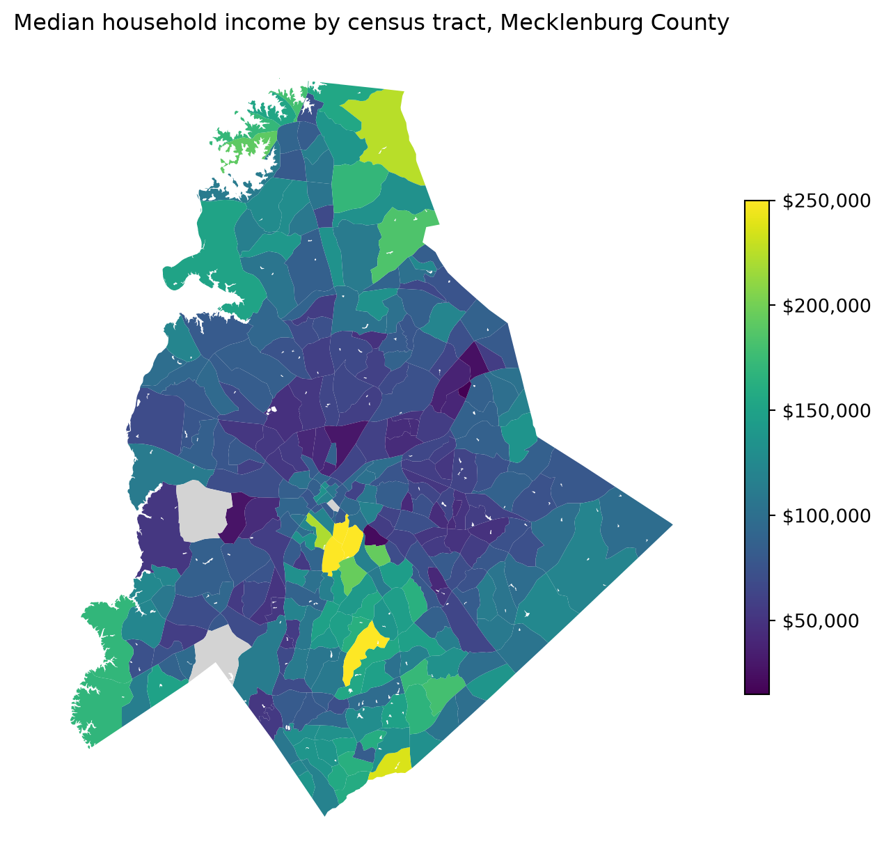
This legend is vertical, so the formatter goes on its yaxis.
Mapping a region with county outlines
To show tracts across several counties, download each county’s tracts and stack them. Then draw county outlines on top so readers can orient themselves. You found the FIPS codes for Iredell (097) and Cabarrus (025) in Part 1.
region_counties = ["Mecklenburg", "Iredell", "Cabarrus"]

region_shapes = tracts(
    state="NC", county=region_counties, cb=True, year=2024, cache=True
).to_crs(32119)

region_income = get_census(
    dataset="acs/acs5",
    year=2024,
    variables={"median_income": "B19013_001E"},
    geo_for="tract:*",
    geo_in="state:37 county:119,097,025",
)

region_map = region_shapes[["GEOID", "geometry"]].merge(
    region_income.to_pandas(), on="GEOID", how="left"
)

region_outlines = nc_shapes[nc_shapes["NAME"].isin(region_counties)].to_crs(32119)
Using FIPS code '37' for input 'NC'
Using FIPS code '119' for input 'Mecklenburg'
Using FIPS code '097' for input 'Iredell'
Using FIPS code '025' for input 'Cabarrus'Plot both layers on the same axes. Use .boundary to draw the county outlines without filling them:
fig, ax = plt.subplots(figsize=(8, 8))

region_map.plot(
    column="median_income",
    cmap="viridis",
    legend=True,
    legend_kwds={"shrink": 0.6},
    missing_kwds={"color": "lightgrey"},
    ax=ax,
)
region_outlines.boundary.plot(ax=ax, color="white", linewidth=1)

ax.set_title("Median household income around Lake Norman")
ax.set_axis_off()
fig.axes[1].yaxis.set_major_formatter(StrMethodFormatter("${x:,.0f}"))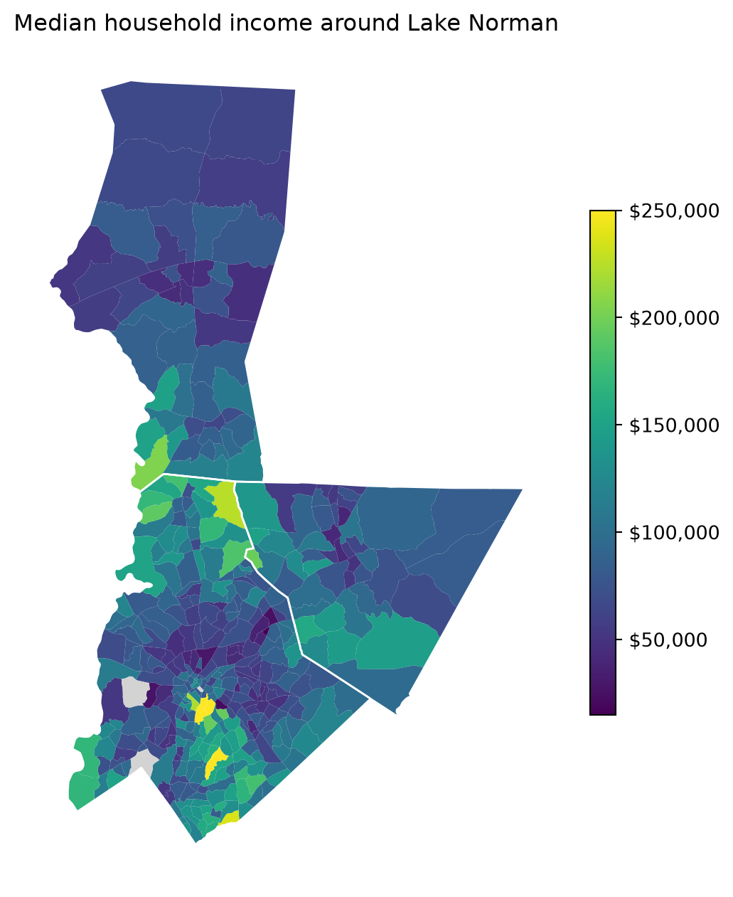
Mapping several variables at once
Small multiples put several maps side by side on one color scale. This example maps four racial and ethnic groups across Mecklenburg tracts from the 2020 Redistricting file. The data is from 2020, so use the 2020 tract shapes.
groups = {"White": "P1_003N", "Black": "P1_004N", "Asian": "P1_006N", "Hispanic": "P2_002N"}

meck_race = get_census(
    dataset="dec/pl",
    year=2020,
    variables={**groups, "total_pop": "P1_001N"},
    geo_for="tract:*",
    geo_in="state:37 county:119",
).with_columns(
    (100 * pl.col(group) / pl.col("total_pop")).alias(group) for group in groups
)

meck_race_map = (
    tracts(state="NC", county="Mecklenburg", cb=True, year=2020, cache=True)
    .to_crs(32119)[["GEOID", "geometry"]]
    .merge(meck_race.to_pandas(), on="GEOID", how="left")
)
Using FIPS code '37' for input 'NC'
Using FIPS code '119' for input 'Mecklenburg'Loop over the groups and draw each one in its own panel. Setting vmin and vmax gives every panel the same scale, from 0 to 100 percent:
fig, axes = plt.subplots(2, 2, figsize=(10, 10))

for ax, group in zip(axes.flat, groups):
    meck_race_map.plot(
        column=group,
        cmap="magma_r",
        vmin=0,
        vmax=100,
        missing_kwds={"color": "lightgrey"},
        ax=ax,
    )
    ax.set_title(group)
    ax.set_axis_off()

fig.colorbar(
    plt.cm.ScalarMappable(norm=plt.Normalize(0, 100), cmap="magma_r"),
    ax=axes,
    shrink=0.6,
    label="Percent of tract population",
)
fig.suptitle("Race and ethnicity by census tract, Mecklenburg County (2020)")
plt.show()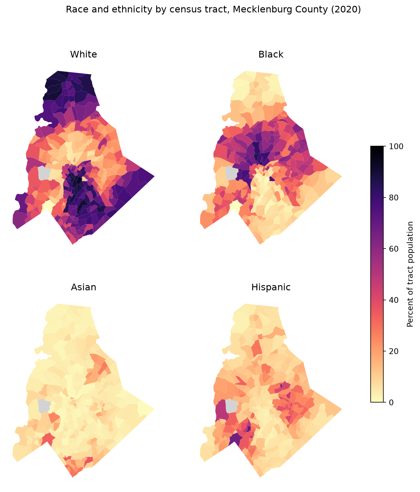
The Census Bureau counts Hispanic origin separately from race. A Hispanic resident may also be counted in one of the race groups, so the four percentages can add up to more than 100.
Interactive maps
A static map is best for a presentation. While you explore, an interactive map lets you zoom in and hover over tracts to read their values. GeoPandas makes one with .explore():
meck_map.explore(
    column="median_income",
    cmap="viridis",
    tooltip=["NAME", "median_income", "median_income_moe"],
    tiles="Esri.WorldGrayCanvas",
)
Make this Notebook Trusted to load map: File -> Trust Notebook
The tiles argument sets the basemap. Esri’s World Gray Canvas is a light gray map with only faint roads and borders, so it doesn’t compete with your colors. It is free and needs no API key. Leave tiles out to get the default OpenStreetMap street map.
In a Jupyter notebook, the map appears below the cell. In a plain script, save it with .save("meck_income.html") and open the file in your browser.
Attaching census shapes to other data
Sometimes your data doesn’t come from the Census Bureau. It might be a table of eviction filings, school test scores, or health outcomes by tract. If it has a GEOID column, the join works exactly as it did above:
my_data = pl.read_csv("my_tract_data.csv", schema_overrides={"GEOID": pl.String})

my_map = meck_shapes[["GEOID", "geometry"]].merge(
    my_data.to_pandas(), on="GEOID", how="left"
)
WarningMatch your years
Tract boundaries changed in 2020. Data that uses 2010 tract GEOIDs won’t join cleanly to 2020 or later shapes. If many rows fail to match, check which decade’s tracts your data uses.
Saving maps and shapes
Save a map as an image for your slides:
fig.savefig("meck_income_map.png", dpi=300, bbox_inches="tight")Save the spatial data itself as a GeoPackage. A GeoPackage keeps the shapes, the data, and the CRS together in one file. Teammates can open it in Python, in R, or in QGIS.
meck_map.to_file("meck_income.gpkg")
TipA shortcut for later
pygris also includes its own get_census() function in pygris.data. It sends the request and returns a pandas DataFrame, and it can build the GEOID for you. Now that you know what happens behind the scenes, feel free to use whichever version you like.
Try it yourself
- Make a county map of the percentage of people below the poverty level in North Carolina, using the poverty data from Part 1. Project it to EPSG 32119.
- Map the median gross rent (
B25064_001E) for census tracts in Mecklenburg, Iredell, and Cabarrus counties. Remove the water and add county outlines. Where are rents highest? - Make a second map that shows the margin of error (
B25064_001M) for the same rent data. Which areas have the least reliable estimates? How would you mention that in a presentation?
Further reading
- The pygris documentation, including its guide to data availability by year
- The GeoPandas mapping guide and its guide to interactive maps
- Kyle Walker’s Analyzing US Census Data is written for R. Chapter 5 explains cartographic boundaries, projections, and yearly boundary changes in ways that apply to pygris too. Chapter 6 is full of good advice on map design.
Using R instead? See Census Data in R, Part 1.