install.packages(c("sf", "tigris", "leaflet"))Census Data in R, Part 2: Mapping with tidycensus and sf
Pulling census geometry and making choropleth maps of North Carolina
Add geometry to your tidycensus requests and map census variables for North Carolina counties and Mecklenburg County census tracts.
NoteAbout this tutorial
Time: about 25 minutes. Prerequisites: Census Data in R, Part 1, with your API key installed.
By the end, you will be able to:
- request census data with shapes attached
- make a choropleth map with ggplot2
- choose a map projection that suits North Carolina
- map census tracts, remove large bodies of water, and add county outlines
- make an interactive map for exploring your data
- attach census shapes to data from somewhere else
Setup
You need three packages beyond the ones from Part 1. sf handles spatial data in R. tigris downloads Census Bureau boundary files. tidycensus uses tigris behind the scenes. leaflet makes interactive maps.
library(tidycensus)
library(tidyverse)
library(sf)
library(tigris)

options(tigris_use_cache = TRUE)
The tigris_use_cache option saves boundary files on your computer after the first download. That makes later requests much faster.
Adding geometry to a request
To get shapes along with your data, add geometry = TRUE to get_acs() or get_decennial(). Everything else stays the same:
nc_income <- get_acs(
  geography = "county",
  state = "NC",
  variables = c(median_income = "B19013_001"),
  year = 2024,
  geometry = TRUE
)
Getting data from the 2020-2024 5-year ACSnc_incomeSimple feature collection with 100 features and 5 fields
Geometry type: MULTIPOLYGON
Dimension: XY
Bounding box: xmin: -84.32187 ymin: 33.84232 xmax: -75.46062 ymax: 36.58812
Geodetic CRS: NAD83
First 10 features:
GEOID NAME variable estimate moe
1 37047 Columbus County, North Carolina median_income 49442 4924
2 37039 Cherokee County, North Carolina median_income 53628 3764
3 37149 Polk County, North Carolina median_income 67758 6109
4 37009 Ashe County, North Carolina median_income 56866 4577
5 37055 Dare County, North Carolina median_income 88994 5211
6 37091 Hertford County, North Carolina median_income 45537 2991
7 37193 Wilkes County, North Carolina median_income 51721 2459
8 37159 Rowan County, North Carolina median_income 65725 2025
9 37089 Henderson County, North Carolina median_income 68187 3678
10 37163 Sampson County, North Carolina median_income 52432 4188
geometry
1 MULTIPOLYGON (((-79.07124 3...
2 MULTIPOLYGON (((-84.31749 3...
3 MULTIPOLYGON (((-82.35925 3...
4 MULTIPOLYGON (((-81.74065 3...
5 MULTIPOLYGON (((-75.72681 3...
6 MULTIPOLYGON (((-77.20861 3...
7 MULTIPOLYGON (((-81.542 36....
8 MULTIPOLYGON (((-80.76537 3...
9 MULTIPOLYGON (((-82.74289 3...
10 MULTIPOLYGON (((-78.67179 3...The result is now an sf object. It looks like a tibble with one extra column named geometry, which stores each county’s outline. The header also reports a CRS (coordinate reference system). Census shapes arrive in NAD83 (EPSG code 4269), which stores locations as longitude and latitude.
You can make a quick map with base R’s plot():
plot(nc_income["estimate"])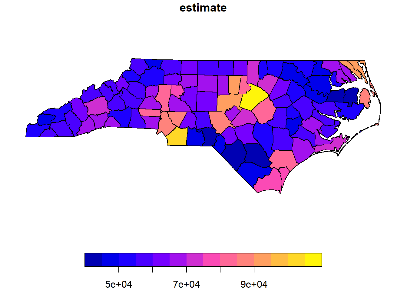
A choropleth map with ggplot2
A choropleth map shades each area by the value of a variable. With ggplot2, geom_sf() draws the shapes and the fill aesthetic sets the colors:
ggplot(nc_income, aes(fill = estimate)) +
  geom_sf(color = "white", linewidth = 0.1) +
  scale_fill_viridis_c(labels = scales::label_dollar()) +
  labs(
    title = "Median household income by county",
    subtitle = "North Carolina, 2020 to 2024 ACS 5-year estimates",
    fill = NULL,
    caption = "Source: US Census Bureau"
  ) +
  theme_void()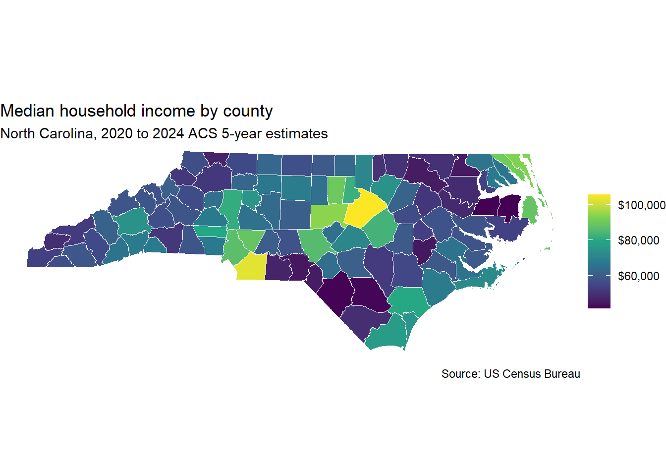
A few choices in that code are worth pointing out:
scale_fill_viridis_c()uses a color scale that is easy to read for people with color vision deficiencies. It also prints well in grayscale.scales::label_dollar()formats the legend as currency.theme_void()removes the axes and gridlines. Latitude and longitude ticks rarely help a reader.
Choosing a projection
Longitude and latitude describe points on a globe. Drawing them directly on a flat screen stretches the map. North Carolina is wide and short, so the distortion is mild, but it is still there. The state has its own projected CRS, called NAD83 / North Carolina (EPSG code 32119). You can switch to it in one line:
nc_income_proj <- st_transform(nc_income, crs = 32119)Plot nc_income_proj with the same ggplot code and compare. The shapes will look a little more like the state you know from official maps. Projected coordinates are measured in meters. That also makes them the right choice for measuring areas and distances.
Mapping census tracts
Tract maps show variation inside a county. Here is median household income for Mecklenburg County tracts:
meck_income <- get_acs(
  geography = "tract",
  state = "NC",
  county = "Mecklenburg",
  variables = c(median_income = "B19013_001"),
  year = 2024,
  geometry = TRUE
) |>
  st_transform(32119)
Getting data from the 2020-2024 5-year ACSggplot(meck_income, aes(fill = estimate)) +
geom_sf(color = NA) +
scale_fill_viridis_c(labels = scales::label_dollar(), na.value = "grey80") +
labs(
title = "Median household income by census tract",
subtitle = "Mecklenburg County, 2020 to 2024 ACS 5-year estimates",
fill = NULL
) +
theme_void()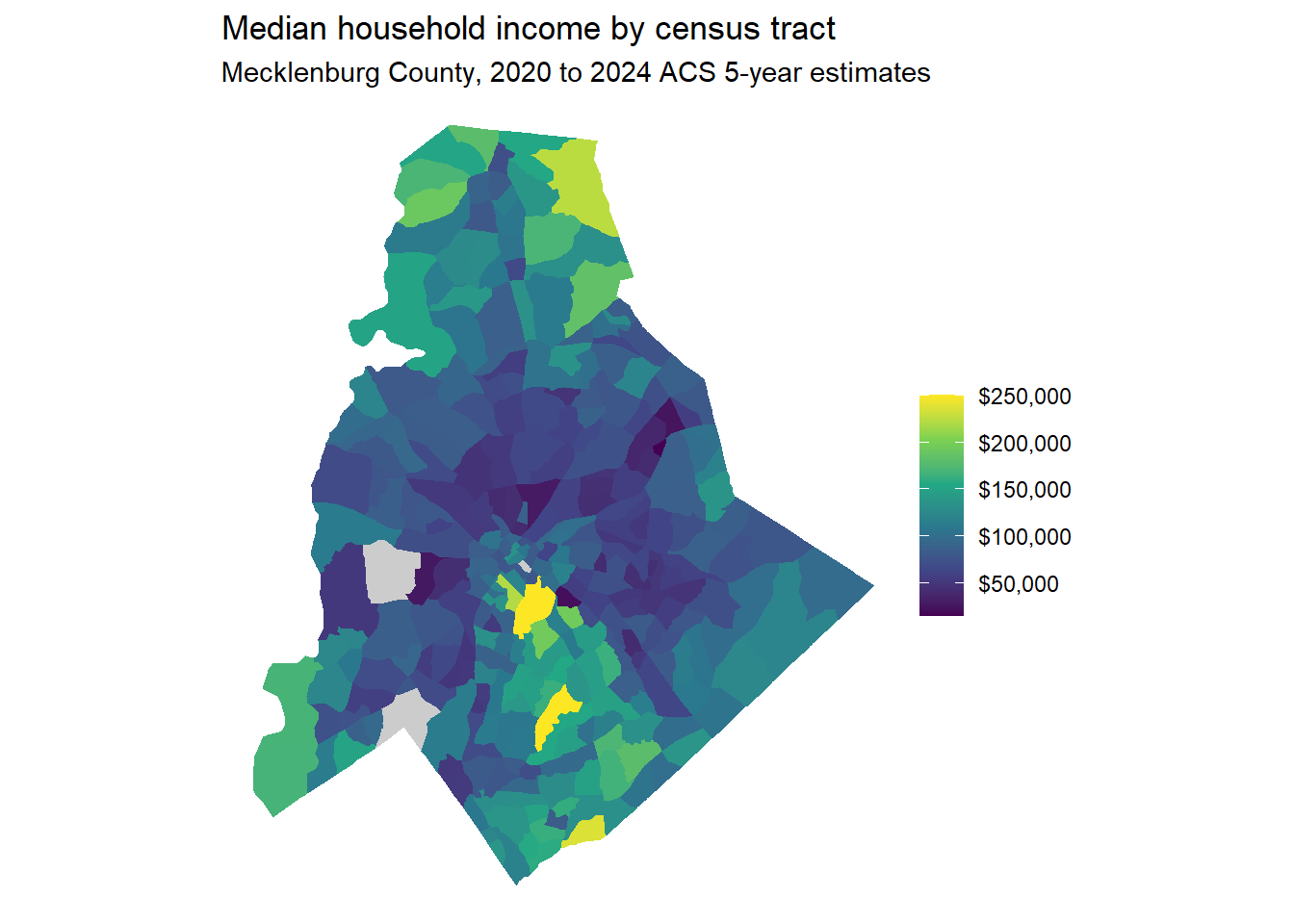
Setting na.value gives tracts with suppressed estimates their own gray color. Without it, those tracts could be mistaken for part of the scale.
Removing water
Census tract boundaries include water. On the northern edge of Mecklenburg County, the tracts along Lake Norman extend into the lake. The map would look more familiar with the lake cut out. erase_water() from tigris removes large bodies of water from your shapes:
meck_income_dry <- erase_water(meck_income, area_threshold = 0.9)Fetching area water data for your dataset's location...Erasing water area...
If this is slow, try a larger area threshold value.The area_threshold argument controls how much water gets erased. A value of 0.9 removes only the largest 10 percent of water features. Run the map code again with meck_income_dry to see the difference. This step can take a minute the first time you run it.
Mapping a region with county outlines
To show tracts across several counties, pass a vector of counties. Then draw county boundaries on top so readers can orient themselves:
region_counties <- c("Mecklenburg", "Iredell", "Cabarrus", "Lincoln", "Gaston")

region_income <- get_acs(
  geography = "tract",
  state = "NC",
  county = region_counties,
  variables = c(median_income = "B19013_001"),
  year = 2024,
  geometry = TRUE
) |>
  st_transform(32119)
Getting data from the 2020-2024 5-year ACSregion_outlines <- counties(state = "NC", cb = TRUE, year = 2024) |>
filter(NAME %in% region_counties) |>
st_transform(32119)
ggplot() +
geom_sf(data = region_income, aes(fill = estimate), color = NA) +
geom_sf(data = region_outlines, fill = NA, color = "white", linewidth = 0.6) +
scale_fill_viridis_c(labels = scales::label_dollar(), na.value = "grey80") +
labs(title = "Median household income around Lake Norman", fill = NULL) +
theme_void()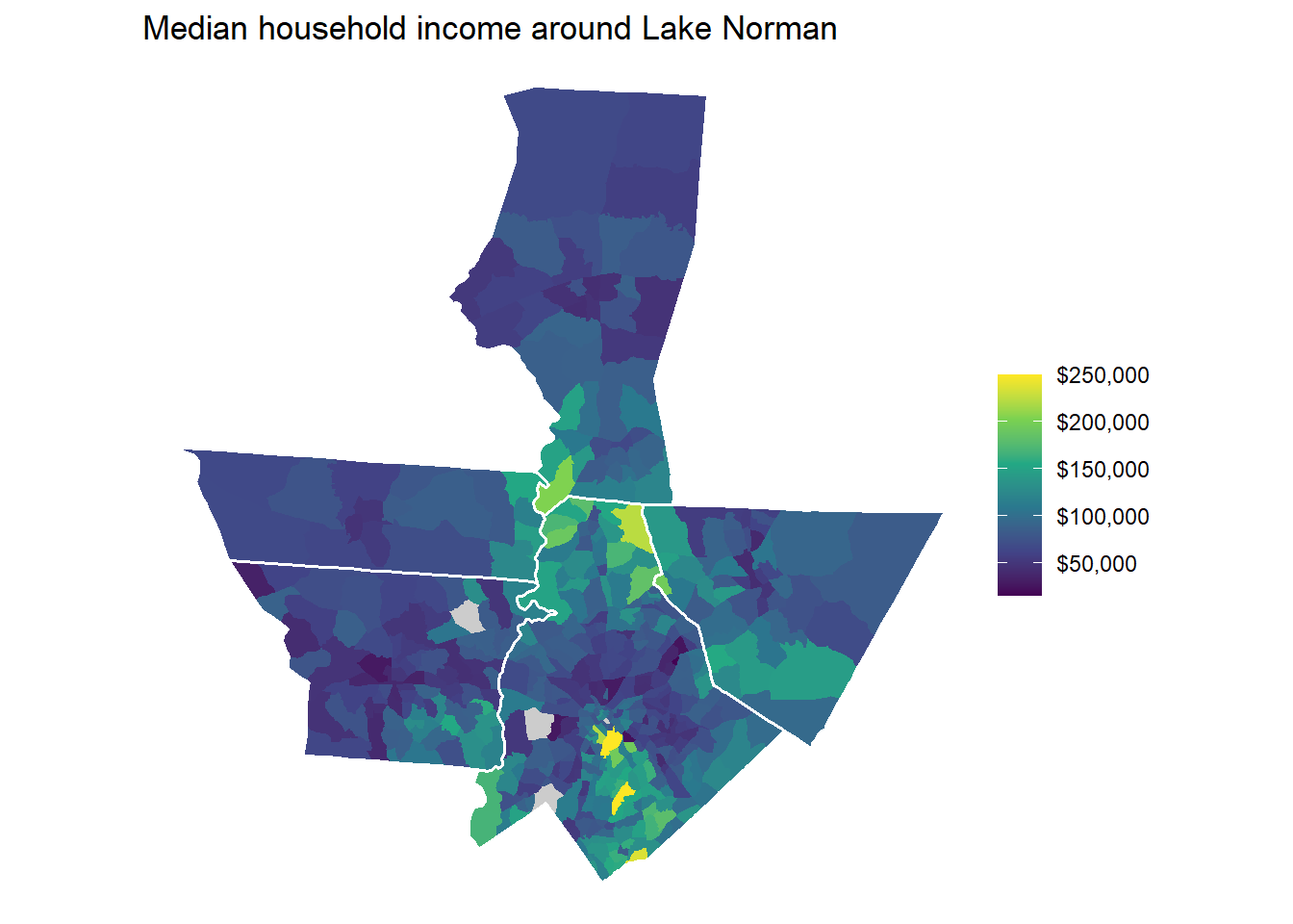
The cb = TRUE argument requests cartographic boundary files. These are simplified shapes that draw quickly and follow the coastline. tidycensus uses them by default when you set geometry = TRUE.
Mapping several variables at once
Long-format data pairs nicely with facet_wrap(). This example maps four racial and ethnic groups across Mecklenburg tracts from the 2020 Redistricting file:
meck_race <- get_decennial(
  geography = "tract",
  state = "NC",
  county = "Mecklenburg",
  variables = c(
    White = "P1_003N",
    Black = "P1_004N",
    Asian = "P1_006N",
    Hispanic = "P2_002N"
  ),
  summary_var = "P1_001N",
  year = 2020,
  sumfile = "pl",
  geometry = TRUE
) |>
  mutate(percent = 100 * value / summary_value) |>
  st_transform(32119)
Getting data from the 2020 decennial CensusUsing the PL 94-171 Redistricting Data Summary FileNote: 2020 decennial Census data use differential privacy, a technique that
introduces errors into data to preserve respondent confidentiality.
ℹ Small counts should be interpreted with caution.
ℹ See https://www.census.gov/library/fact-sheets/2021/protecting-the-confidentiality-of-the-2020-census-redistricting-data.html for additional guidance.
This message is displayed once per session.ggplot(meck_race, aes(fill = percent)) +
geom_sf(color = NA) +
facet_wrap(~variable) +
scale_fill_viridis_c(option = "magma", direction = -1, na.value = "grey80") +
labs(
title = "Race and ethnicity by census tract, Mecklenburg County",
subtitle = "2020 decennial census",
fill = "Percent"
) +
theme_void()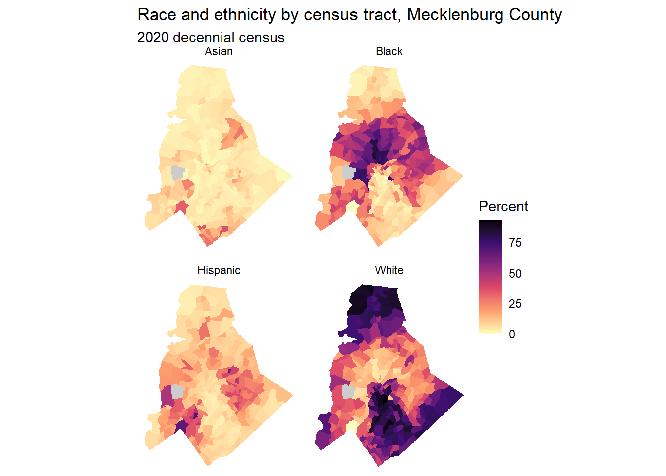
The four panels share one color scale. That makes it easy to compare where each group lives. One caution applies here. The Census Bureau counts Hispanic origin separately from race. A Hispanic resident may also be counted in one of the race groups, so the four percentages can add up to more than 100.
Interactive maps
A static map is best for a presentation. While you explore, an interactive map lets you zoom in and hover over tracts to read their values. leaflet builds interactive web maps from R. It uses the same JavaScript library that powers many of the maps you see on news sites.
leaflet expects longitude and latitude, so first transform the data to EPSG 4326 (WGS84), the standard CRS for web maps. Then build a color palette that maps each income to a color:
library(leaflet)

meck_web <- st_transform(meck_income, 4326)

income_pal <- colorNumeric("viridis", domain = meck_web$estimate)
A leaflet map is built in layers, much like a ggplot. Start with a basemap, then add the tracts, then add a legend:
leaflet(meck_web) |>
  addProviderTiles(providers$Esri.WorldGrayCanvas) |>
  addPolygons(
    fillColor = ~income_pal(estimate),
    fillOpacity = 0.7,
    color = "white",
    weight = 0.5,
    label = ~paste0(NAME, ": ", scales::dollar(estimate), " ± ", scales::dollar(moe))
  ) |>
  addLegend(
    pal = income_pal,
    values = ~estimate,
    title = "Median household income",
    labFormat = labelFormat(prefix = "$")
  )
Here is what each layer does:
addProviderTiles()draws a basemap underneath your data. Esri’s World Gray Canvas is a light gray map with only faint roads and borders, so it doesn’t compete with your colors. It is free and needs no API key. Some other providers, such as CARTO, now require a key. For a full street map, useaddTiles()instead, which draws OpenStreetMap.addPolygons()draws the tracts. The~in front of an argument tells leaflet to look up a column in your data.labelsets the text that appears when you hover over a tract.addLegend()explains the colors. It uses the same palette function as the polygons, so the two always match.
Hover over the tracts to see each estimate and its margin of error. This is a quick way to find the tracts behind a pattern you notice.
Attaching census shapes to other data
Sometimes your data doesn’t come from the Census Bureau. It might be a table of eviction filings, school test scores, or health outcomes by tract. If the table has a GEOID column, you can download shapes with tigris and join them:
meck_tracts <- tracts(state = "NC", county = "Mecklenburg", cb = TRUE, year = 2024)

# Suppose my_data has a GEOID column stored as text
meck_joined <- meck_tracts |>
  left_join(my_data, by = "GEOID")
Put the sf object on the left side of the join. The result then stays an sf object, and ggplot2 can map it. Before you join, check that the GEOIDs in both tables are text and that they have the same number of digits.
WarningMatch your years
Tract boundaries changed in 2020. Data that uses 2010 tract GEOIDs won’t join cleanly to 2020 or later shapes. If many rows fail to match, check which decade’s tracts your data uses.
Saving maps and shapes
Save a ggplot map as an image for your slides:
ggsave("meck_income_map.png", width = 8, height = 6, dpi = 300)Save the spatial data itself as a GeoPackage. A GeoPackage keeps the shapes, the data, and the CRS together in one file. Teammates can open it in R, in Python, or in QGIS.
st_write(meck_income, "meck_income.gpkg")Try it yourself
- Make a county map of the percentage of people below the poverty level in North Carolina, using the
summary_varapproach from Part 1. Project it to EPSG 32119. - Map the median gross rent (
B25064_001) for census tracts in Mecklenburg, Iredell, and Cabarrus counties. Remove the water and add county outlines. Where are rents highest? - Make a second map that shows the margin of error (the
moecolumn) for the same rent data. Which areas have the least reliable estimates? How would you mention that in a presentation?
Further reading
From Kyle Walker’s Analyzing US Census Data:
- Chapter 5: Census geographic data and applications in R, which covers tigris, projections, and cartographic boundary files
- Chapter 6: Mapping Census data with R, which covers ggplot2, tmap, and interactive maps in much more depth
Using Python instead? See Census Data in Python, Part 1.